
Lower Accident Risk Through Variable Interfaces For Smartphone Apps
Many pedestrians use their smartphones while they walk along. Instead of paying attention to traffic, their eyes are glued to the display, which poses a huge risk potential.
When making a call, listening to music, typing, checking e-mail, or using apps, the amount of attention being paid to street traffic is very limited. That is why Fraunhofer scientists have investigated how an app’s user interface should be designed to minimize the degree to which users are distracted from their surroundings. The studies focused on the size of fonts and interaction buttons.
Drivers aren’t the only ones who are at risk of an accident when on the phone. The same applies for pedestrians using their smartphone in street traffic – they are distracted in the very same way as drivers are. Hazards range from overseeing uneven ground to not being attentive when crossing busy roads.
An international study by DEKRA’s accident research in six European capitals comes to the conclusion that of the nearly 14,000 pedestrians surveyed, around 17 percent are using their smartphone in street traffic.
Accidents repeatedly occur due to this inattentiveness and some of them are fatal. The scientists at the Fraunhofer Institute for Communication, Information Processing and Ergonomics FKIE also see urgent need for action. Their approach to solving this problem: the interfaces for smartphone apps need to be designed so that users are distracted as little as possible in street traffic.
When reading longer messages, users adjust their behavior, walk slower or come to a halt. However, speed is often not adjusted for short messages, like the ones seen in navigation systems, which means attention to surroundings lapses and the risk of an accident rises. The FKIE researchers hope to create a graphics interface that minimizes the degree of distraction caused by these kinds of smartphone interactions.
That is why they are focussing on individual words that can be read at a glance. The test results were used to design GUIs (graphical user interfaces) that can be integrated into navigation apps or any other kind of application.
Visual acuity significantly reduced when walking
First, the scientists studied the influence walking has on visual acuity when looking at a smartphone. They discovered that visual acuity dropped 20 percent when walking compared to when standing. Fonts would therefore have to be 20 percent larger in order to counteract that effect.
“That is quite considerable. It’s as if your visual acuity in an eye chart deteriorates by one line,” said Jessica Conradi, scientist, project manager, and deputy head of department at Fraunhofer FKIE.
Further studies focussed on font size: How large does a font need to be for text content to be read as quickly as possible?
Required font size increases with walking speed
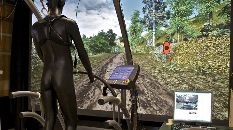
Studies involving more than 20 subjects aged 26 to 36 were carried out indoors under laboratory conditions on a treadmill with various types of modern smartphone. Experiment participants wore head-mounted systems with infrared cameras that recorded eye movements. In order to simulate real traffic situations, the test subjects were distracted using a virtual environment. The experiment variables were word length, duration of display, and walking speed.
“All three factors influence the font size needed in order to read words reliably. That was indicated by all experiments,” said Conradi.
Some of the study findings: longer words require a font size 12 percent larger than shorter words do. For shorter display times, a 20-percent-larger font size should be used. When walking, words even need to be 47 percent larger than when standing in order to attain the same level of legibility. The difference in optimum font size between slow walking and fast walking is 15 percent – that means the font size should increase with walking speed.
Conradi explained the test scenario as follows: “Since font sizes are not comparable and screen resolutions vary between displays, we were unable to express size in points. That is why we chose millimeters as the value to describe the height of capital letters. The distance from eye to smartphone was 45 centimeters.”
As far as optimum button size is concerned, results were similar: different sizes are needed when standing than when walking in order to click correctly in the shortest amount of time possible with as few failed attempts as possible. When standing, icons should have a minimum size of 8×8 millimeters. However, the number of button “misclicks” was even lower at 11×11 millimeters. When walking, optimum button size was 14×14 millimeters.
That is why the engineer recommends different GUIs for standing, slow walking, and swift walking. Conradi recommended that App developers should adjust their applications to the reduced visual acuity experienced when walking.
Based on her research, she has developed a concept via which GUIs can be adjusted to the various phases when using a navigation app.
“Since reading becomes more difficult while walking, especially when fonts and buttons are small, many pedestrians do not hold their smartphones at arm’s length. However, by bringing the device closer to one’s face, the field of vision becomes more restricted, which again increases the risk of an accident – that, too, is an argument in favor of adapting interfaces,” the scientist said.